Mobile Banking Experience Redesign
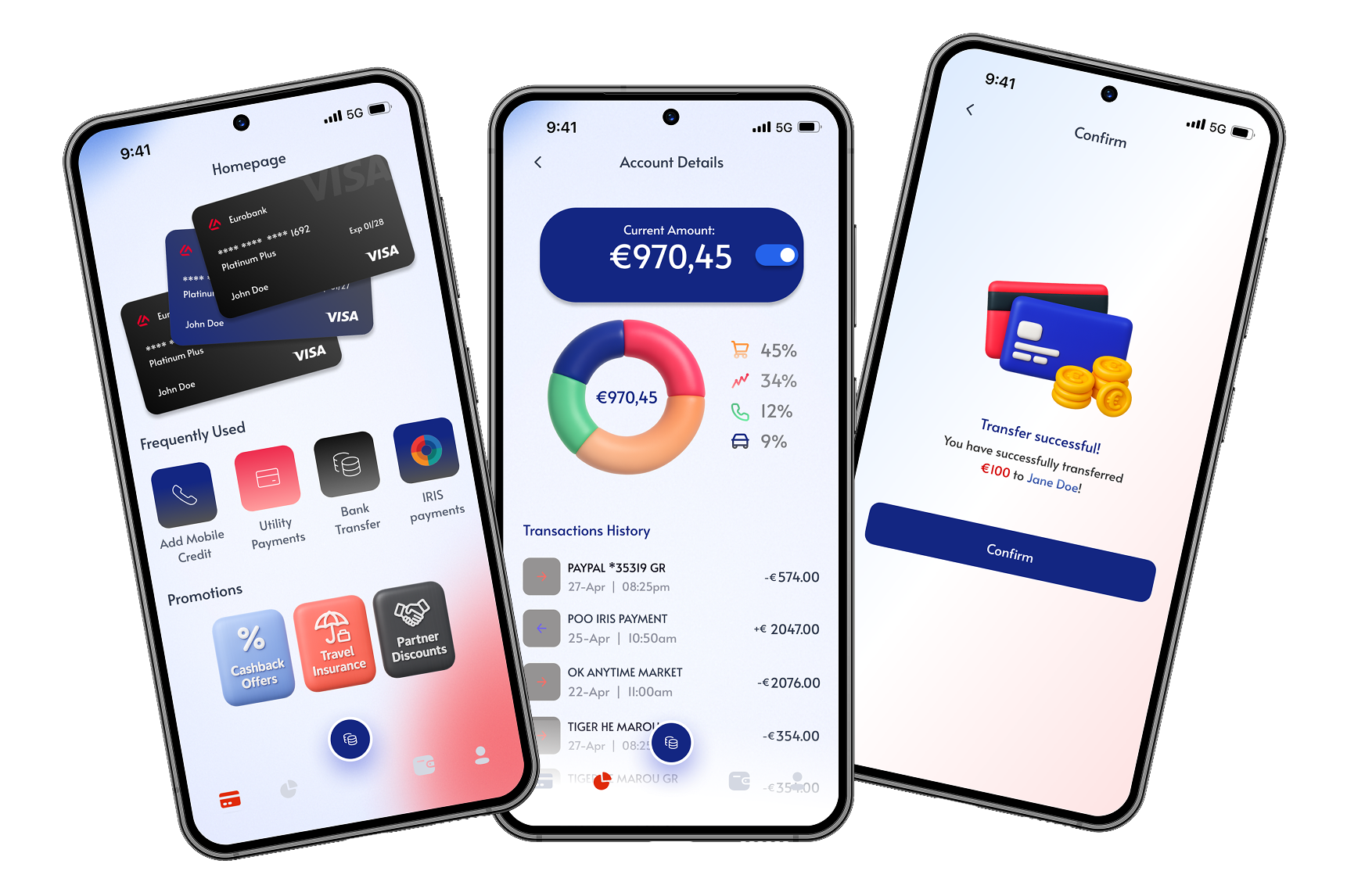
Five taps to check your balance. I traced every dead end in the flow before opening a single frame.
Read Case Study →I design it and then I build it. Nothing exposes a bad design decision faster than having to write the code for it.
Featured Project
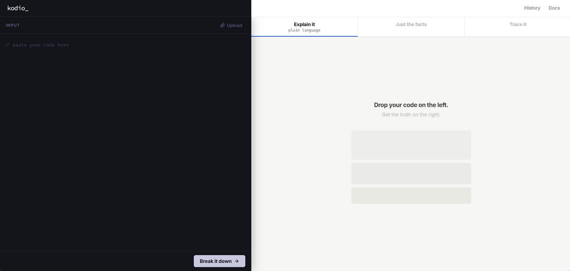
A code reading tool designed for two very different users — someone learning to code for the first time, and a developer reviewing unfamiliar work. One tool, two completely different mental models.
Most code explanation tools either talk down to beginners or bury experienced developers in noise. kodio separates those two needs into distinct modes — same content, different voice — so neither user has to fight the interface.
Case Studies
Five taps to check your balance. I traced every dead end in the flow before opening a single frame.
Read Case Study →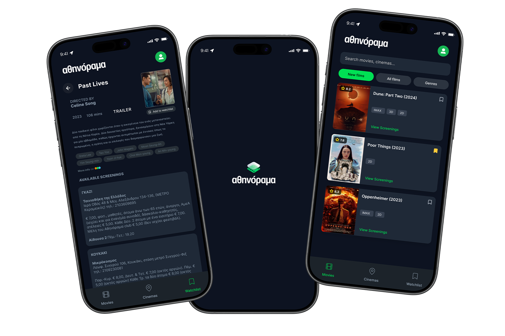
The app had every showtime in Athens. Finding one took longer than just Googling it.
Read Case Study →Approach
I trace where users actually stall. Most redesigns fail because they address symptoms, not the structure underneath them.
I annotate decisions, flag constraints, and write specs as part of the design process — not an afterthought. Work that doesn't survive development isn't finished.
I test rough prototypes early, specifically looking for the moment a user stops reading and starts guessing. That moment almost always appears earlier in the flow than expected — and it's usually a structural problem, not a visual one.
About
My first instinct with any flow is to find where it starts asking too much of the person using it. Not "how do we make this look better" — "why does this step exist at all." I design in Figma and build in code, which means the handoff is my problem from the start. Most of what I ship looks simpler than the first version. That's usually the point.
Athens, Greece
UI/UX Design
Freelance · Remote · Hybrid